Scroll 6: Ramses' Plots

Welcome to Scroll 6 of 8, from the Djoser’s Bulk RNAseq Tutorial Codex.
In this scroll, we bring our results to life through powerful visualizations, we will explore the MA plot, PCA plot, Volcano plot, and Heatmaps. Each one offers a unique lens into our results, we will also interpret each visualization to uncover the biological meaning behind the patterns.
Let’s bring our data into focus.
📜 Scroll Objectives
- MA Plot
- Principal Component Analysis (PCA) Plot
- Volcano Plot
- Heatmaps
- Cultural Spotlight: Ramses II – The Monumental Ruler of Egypt
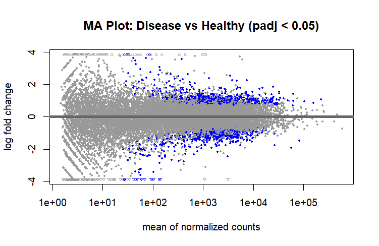
MA Plot
An MA plot is a type of scatter plot used in RNA-seq differential expression analysis to visualize the relationship between the average expression of genes and their log fold change between two conditions.
- The x-axis (A) shows the mean expression level of a gene across all samples (often on a log scale).
- The y-axis (M) shows the log2 fold change between conditions.
It is useful because it helps with:
- Highlighting differentially expressed genes (DEGs): Genes with large positive or negative log fold changes stand out above or below the horizontal center.
- Revealing low-expression noise: Points clustered at low average expression (far left) are more prone to variability and may be unreliable.
- Providing a Quick visual QC: Outliers or asymmetry might hint at data normalization issues.
How to Generate a MA Plot?
Before we proceed, remember that in our workspace we have:
res→ The DESeq2 results object containing all tested genes with their log2 fold changes, p-values, and adjusted p-values.DEGs→ A filtered subset ofrescontaining only the significantly differentially expressed genes based on our chosen thresholds (padj < 0.05 & abs(log2FoldChange) > 1).
Now, to visualize differential expression results, we can generate an MA plot:
1
plotMA(res, alpha = 0.05, main = "MA Plot: Disease vs Healthy (padj < 0.05)")
-
plotMA()→ Generates an MA plot where:- The x-axis = mean expression of genes (in normalized counts).
- The y-axis = log2 fold change (log2FC).
- Each dot = a gene.
- Blue dots = genes significantly differentially expressed based on
alpha.
alpha= 0.05 → Highlights genes with adjusted p-values less than 0.05.main→ Title of the plot.
MA Plot Interpretation
MA Plot
- For the Overall distribution, most points cluster around the Y = 0 line, suggesting that for the majority of genes, expression is similar between the two conditions.
- Some Genes are upregulated (Y > 0) in Disease compared to healthy and some are downregulated (Y < 0).
- At low average expression (X axis), there’s more scatter, which is typical due to increased variance in low-abundance genes.
- Blue dots mark genes passing the FDR threshold (padj < 0.05), concentrated mostly in the upper and lower extremes (these are our DEGs).
Principal Component Analysis (PCA) Plot
PCA is a dimensionality reduction technique that summarizes variation in large datasets into a few principal components that explain the largest sources of variance.
It lets us quickly see how samples cluster based on their gene expression profiles. Samples that are biologically similar group closely together, while those with major differences (disease vs healthy) separate along one or more principal components.
It also helps assess reproducibility between replicates, detect batch effects, and visualize overall expression patterns and can be considered as a very important step for Quality Control (QC).
Before Diving into PCA, we need to understand Variance Stabilizing Transformation (vst).
Variance Stabilizing Transformation (vst)
Raw RNAseq count data has a mean-variance relationship, genes with higher counts tend to have higher variance. PCA assumes the variance in the data is constant, so we perform Variance Stabilizing Transformation (vst) to transform counts into a scale where variance is stabilized across the range of expression levels.
This makes differences between samples easier to interpret and prevents highly expressed genes from dominating the PCA.
How to Generate a PCA Plot?
We run vst() on our dataset to stabilize the variance, then we can use the plotPCA() function to generate a PCA Plot.
1
2
3
4
5
# Variance stabilizing transformation
vst <- vst(dds)

# PCA plot using the top 1000 most variable genes
plotPCA(vst, ntop = 1000, intgroup = "Condition")
ntop=1000: Uses the top 1000 most variable genes to compute PCA, focusing on genes that carry the most biological signal instead of noise (sometimes it can be increased a bit to capture the most variance).Condition: The grouping variable used to color the samples (Disease vs. Healthy).
PCA Plot Interpretation
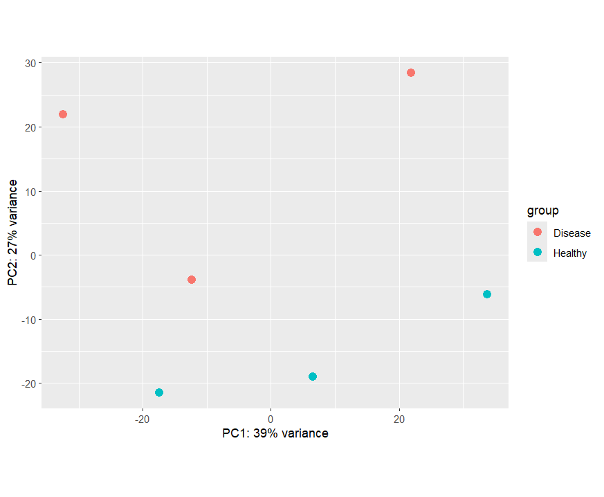
PCA Plot
- In the PCA plot, Alongside PC2, samples from the Healthy group clustered at the bottom while the Disease group cluster relativly at the top except for one disease sample which seems to be closer to Healhy group rather than the diesease group.
- PC2 explains 27% of the total variance. This indicates strong expression differences between the two conditions.
- PC1 (39% variance) captures more crosswide variation, possibly biological differences within conditions, expression patterns, or individual-specific effects.
Bonus: Adding more details to your plots using ggplot2
We can regenerate our PCA plot but this time while adding more info and aesthetics using ggplot2.
first we need to extract the PCA Plot Data
1
pcaData <- plotPCA(vst, ntop=1000, "Condition", returnData = TRUE)
and then use ggplot2 to create a more customized plot.
1
2
3
4
5
6
7
8
9
library(ggplot2)

ggplot(pcaData, aes(PC1, PC2, color=Condition, label=name)) +
  geom_point(size=4) +
  geom_text(aes(label = name), vjust = 1.5, size = 4, show.legend = FALSE) +
  labs(x=paste0('PC1: ', round(100 * attr(pcaData, "percentVar")[1], 1), '%'),
       y=paste0('PC2: ', round(100 * attr(pcaData, "percentVar")[2], 1), '%'),
       title='PCA Plot with Sample Labels',
       subtitle='PC1 vs PC2')
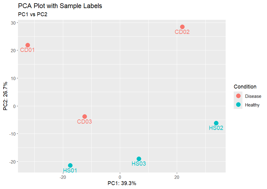
PCA ggPlot
Here we can clearly see the sample names and we can identify that sample CD03 is a possible outlier and could be due to technical variability or biological differences.
Volcano Plot
A volcano plot is a type of scatter plot that displays statistical significance (padj on Y-axis) versus magnitude of change (log2FoldChange on X-axis) for each gene.
It allows us to quickly identify genes that are both statistically significant and biologically meaningful.
Genes in the top left and top right corners are the most interesting, they have large fold changes and high significance.
Volcano plots help us:
- Highlight key differentially expressed genes worth deeper investigation.
- Visually separate upregulated and downregulated genes.
- Get a quick overview of the balance between the number of genes affected in each direction.
How to Generate a Volcano Plot?
We will use the EnhancedVolcano library to generate our volcano plot.
1
2
3
4
5
6
7
8
9
10
11
12
13
library(EnhancedVolcano)

# Producing a Volcano Plot
EnhancedVolcano(res.df,
                lab = res.df$gene_name,      # The labels for each point (gene names)
                x = "log2FoldChange",        # X-axis: log2 fold change (magnitude & direction of change)
                y = "padj",                  # Y-axis: adjusted p-value (statistical significance)
                pCutoff = 0.05,               # Horizontal threshold: significance cutoff
                FCcutoff = 1,                 # Vertical threshold: fold-change cutoff (|log2FC| > 1)
                title = "Volcano Plot: Disease vs Healthy", # Plot title
                pointSize = 2.0,              # Size of each plotted point
                xlim = c(-10, 10),            # Range of X-axis
                ylim = c(0, 10))              # Range of Y-axis
Volcano Plot Interpretation
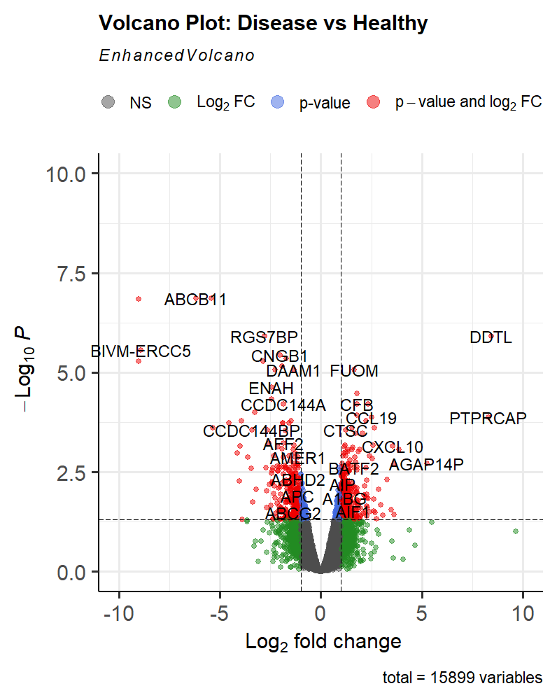
Volcano Plot
This volcano plot provides a visual summary of the differential expression analysis results.
The Red Dots represent our DEGs
-
Significant Genes: Genes that fall above the horizontal line (pCutoff) are considered statistically significant (Blue & Red Dots). Those that also fall outside the vertical lines (FCcutoff) are biologically significant (Green & Red Dots).
-
Direction of Change: Genes on the right side of the plot are upregulated in the disease condition, while those on the left are downregulated.
-
Magnitude of Change: The further a gene is from the center (0 on the X-axis), the larger the fold change, indicating a more substantial difference between conditions.
-
Outliers: Genes that are far from the main cluster may represent interesting biological phenomena or technical artifacts.
Heatmaps
A heatmap is a graphical representation of data where values are shown as colors.
They allow us to visualize patterns of gene expression across multiple samples, helping us quickly identify clusters of genes with similar expression profiles or samples with similar overall patterns.
This makes it easier to spot biologically relevant trends, such as groups of genes that are upregulated or downregulated together.
While heatmaps are most informative when focused on a smaller subset of genes (e.g., inflammation-associated or immunity-related genes), in this tutorial we will create one using all differentially expressed genes (DEGs) for demonstration purposes.
How to Generate a Heatmap?
We’ll use the pheatmap package to generate our plot:
1
2
3
4
5
6
7
8
9
10
11
12
library(pheatmap)

# Extract expression values from variance-stabilizing transformed (VST) data
heatmapData <- assay(vst)[DEGs$gene_name,]

# Generate the heatmap
pheatmap(
  heatmapData,
  cluster_cols = TRUE,
  main = "Expression Patterns of All DEGs",
  show_rownames = FALSE
)
Heatmap Interpretation
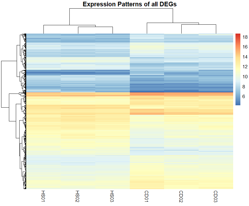
Heatmap of All DEGs
This heatmap provides a visual summary of the expression patterns of all differentially expressed genes (DEGs). Each row represents a gene, and each column represents a sample.
The color intensity indicates the level of expression, with warmer colors representing higher expression levels and cooler colors representing lower expression levels.
The heatmap allows for the clustering of genes and samples based on expression patterns. This can help identify groups of co-expressed genes or samples with similar expression profiles.
Heatmaps Provide much more valuable insights when done on a specific set of genes or DEGs rather than on all DEGs, where you can identify a set of genes that are co-expressed or exhibit similar patterns across conditions.
That’s it! You’ve successfully generated Visualizations and Plots using multiple R libraries and learned how to interpret them.
If you want to continue, head over to the next scroll: Thutmose’s Trends, where we’ll Proceed to more advanced topics like Functional and Pathway Enrichment Analyses.
Cultural Spotlight Incoming!
🏛️ Cultural Spotlight: Ramses II – The Monumental Ruler of Egypt

Ramses II, often called Ramses the Great, reigned over ancient Egypt for an astonishing 66 years during the 13th century BCE. Known for his military power, vast building projects, and masterful diplomacy, Ramses transformed Egypt into a superpower of the ancient world. He led campaigns into the Levant, secured Egypt’s borders, and forged one of history’s first recorded peace treaties with the Hittites.

One of his most iconic legacies is the Abu Simbel temples, carved into the cliffs of Nubia. These colossal monuments, with four towering statues of Ramses guarding the entrance, were designed to project his power and divine authority to anyone approaching Egypt’s southern frontier.
To this day, Ramses II remains a symbol of ambition, resilience, and the desire to leave an everlasting mark on history, a fitting inspiration for any great endeavor.
Papyrus Background from the Post’s Cover photo is from Freepik