Introducing PyPyrus Map

PyPyrus Map: Python + Papyrus. A metabolic map drawn on a digital scroll, with a Menhed in hand. :D
PyPyrus Map: Metabolic neighborhood visualization for COBRApy genome-scale models.
PyPyrus Map lets you instantly visualize the full reaction neighborhood of any metabolite in a COBRApy-compatible genome-scale model, including heterologous and non-native pathways and Outputs the graph in a variety of files including publication-quality vector figures (SVG, PDF) suitable for direct journal submission.
Why PyPyrus Map?
As Part of Project Menhed, I wanted a quick clear and visual way identify what was consuming or producing the metabolite of interest i have, while this information is indeed stored in the Genome Scale Model and COBRApy, the only way was to only to either print them out in a text format or use other visualization tools like Escher.
Escher Works Great but falls short when the model has heterologous and non-native pathways introduced to it, and in this case you will need to draw these new pathways in an Escher map to visualize it, and this takes time and effort especially when the introduced pathways are a lot and complex, and here comes PyPyrus Map, Once you already introduce your pathways into the COBRApy session as usual, PyPyrus Map will automatically be able to instantly access them since it is built on top of COBRApy, and can produce the needed visualizations of the reactions and metabolites network without any need to redraw pathway maps.
PyPyrus Map Case Example
Installing PyPyrus Map
You can install PyPyrus Map using pip:
1
pip install pypyrus-map
Also Install Graphviz (required for layout="dot"):
1
2
3
4
5
6
7
8
9
10
# Ubuntu / Debian
apt-get install graphviz

# macOS
brew install graphviz

# Windows
# Download and run the installer from https://graphviz.org/download/
# During installation, tick "Add Graphviz to system PATH"
# Then restart your terminal
And also make sure you have COBRApy installed as well:
1
pip install cobra
Introducing the Lycopene Pathway into the COBRApy Model
In this example, I will be using the iML1515 E Coli model and introducing the Lycopene pathway into it.
Introducing the Lycopene Pathway Metabolites
1
2
3
4
5
6
7
8
9
10
11
12
13
14
15
16
17
18
19
20
21
22
23
24
25
26
27
28
29
30
31
32
33
34
35
36
37
38
39
40
import cobra

# Loading the E coli iML1515 Model
model = cobra.io.load_model("iML1515")

from cobra import Metabolite

# Create GGPP (Geranylgeranyl diphosphate)
ggpp = Metabolite(
    id='ggpp_c',
    formula='C20H33O7P2',
    name='Geranylgeranyl diphosphate',
    compartment='c'
)

# Create Phytoene
phytoene = Metabolite(
    id='phytoene_c',
    formula='C40H64',
    name='Phytoene',
    compartment='c'
)

# Create Lycopene
lycopene = Metabolite(
    id='lycopene_c',
    formula='C40H56',
    name='Lycopene',
    compartment='c'
)

# Add the Metabolites to the model
model.add_metabolites([ggpp, phytoene, lycopene])

# Load Other Existing Metabolites from the model
fpp = model.metabolites.get_by_id("frdp_c")  # Farnesyl diphosphate
ipp = model.metabolites.get_by_id("ipdp_c")  # Isopentenyl diphosphate
ppi = model.metabolites.get_by_id("ppi_c")   # Pyrophosphate
q8  = model.metabolites.get_by_id("q8_c")    # Ubiquinone-8
q8h2= model.metabolites.get_by_id("q8h2_c")  # Ubiquinol-8
Introducing the Lycopene Pathway Reactions
1
2
3
4
5
6
7
8
9
10
11
12
13
14
15
16
17
18
19
20
21
22
23
24
25
26
27
28
29
30
31
32
33
34
35
36
37
38
39
40
41
42
43
44
45
from cobra import Reaction

# Reaction 1: GGPP Synthase (CrtE)
# FPP + IPP -> GGPP + PPi
crtE = Reaction('CRTE')
crtE.name = 'GGPP Synthase'
crtE.lower_bound = -1000
crtE.upper_bound = 1000
crtE.add_metabolites({
    fpp: -1,
    ipp: -1,
    ggpp: 1,
    ppi: 1
})

# Reaction 2: Phytoene Synthase (CrtB)
# 2 GGPP -> Phytoene + 2 PPi
crtB = Reaction('CRTB')
crtB.name = 'Phytoene Synthase'
crtB.lower_bound = -1000
crtB.upper_bound = 1000
crtB.add_metabolites({
    ggpp: -2,
    phytoene: 1,
    ppi: 2
})

# Reaction 3: Phytoene Desaturase (CrtI)
# Phytoene + 4 Quinone -> Lycopene + 4 Quinol
crtI = Reaction('CRTI')
crtI.name = 'Phytoene Desaturase'
crtI.lower_bound = 0
crtI.upper_bound = 1000
crtI.add_metabolites({
    phytoene: -1,
    q8: -4,
    lycopene: 1,
    q8h2: 4
})

# Add the Reactions to the model
model.add_reactions([crtE, crtB, crtI])

# Create the demand Reaction for accumulation/harvesting.
lycopene_demand = model.add_boundary(model.metabolites.get_by_id("lycopene_c"), type="demand")
Visualizing the Lycopene Pathway Neighborhood with PyPyrus Map
Now that we have the Lycopene pathway introduced into the COBRApy model, we can use PyPyrus Map to visualize the neighborhood of Lycopene.
1
2
3
4
5
6
7
8
9
from pypyrus_map import PyPyrusMap

# Create a PyPyrus Map session and add the Lycopene metabolite
session = PyPyrusMap(model)
session.add("lycopene_c")

# Render the graph
fig = session.render(title="Lycopene Network", figsize=(15, 6))
fig.show()
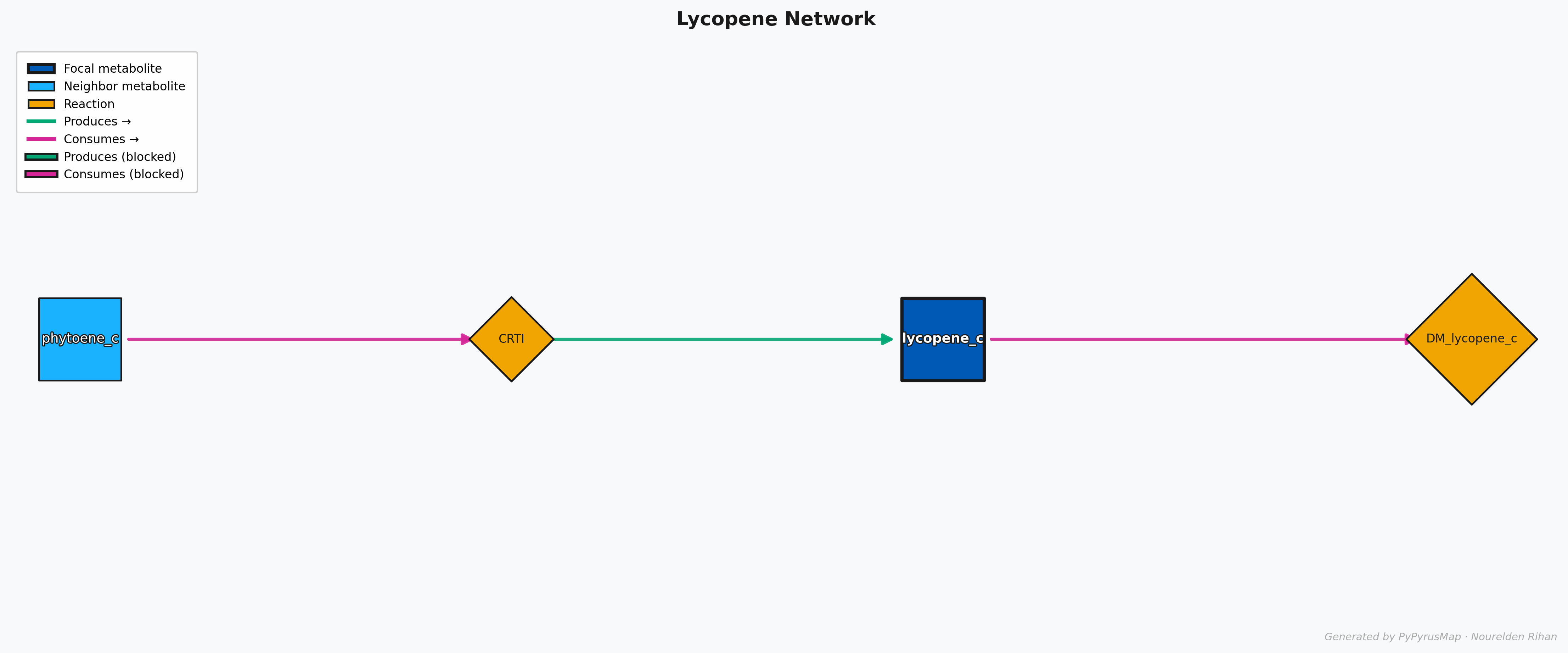
PyPyrus Map Lycopene Network Graph
As You can see here, The molecule of interest (Lycopene) is in the center with a dark shade of blue and a thick black border, while the other metabolites in the network are in lighter blue.
The reactions are represented as orange rotated boxes connecting the metabolites, and the direction of the arrow indicates the direction of the reaction. The graph is automatically laid out using the “dot” layout algorithm, which organizes the nodes in a hierarchical manner.
Each Reaction Node has arrows pointing towards it or out of it, and they are color coded for easy interpretation, the Magneta Arrows means something is being consumed, so in this case the Lycopene Synthase (CrtI) is consuming Phytoene, and the green Arrows means something is being produced, so in this case the Lycopene Synthase (CrtI) is producing Lycopene.
If a Flux Balance Analysis (FBA) solution is provided, you might see some Arrows that have a black background, this means that the reaction is either blocked or has 0 Flux in the provided solution.
Exporting the Graph
You can export the graph to a file, many formats are supported including SVG, PDF, PNG, and more. For example, to export the graph as a PNG file:
1
session.export("Lycopene_Network.png")
More Examples and Customization
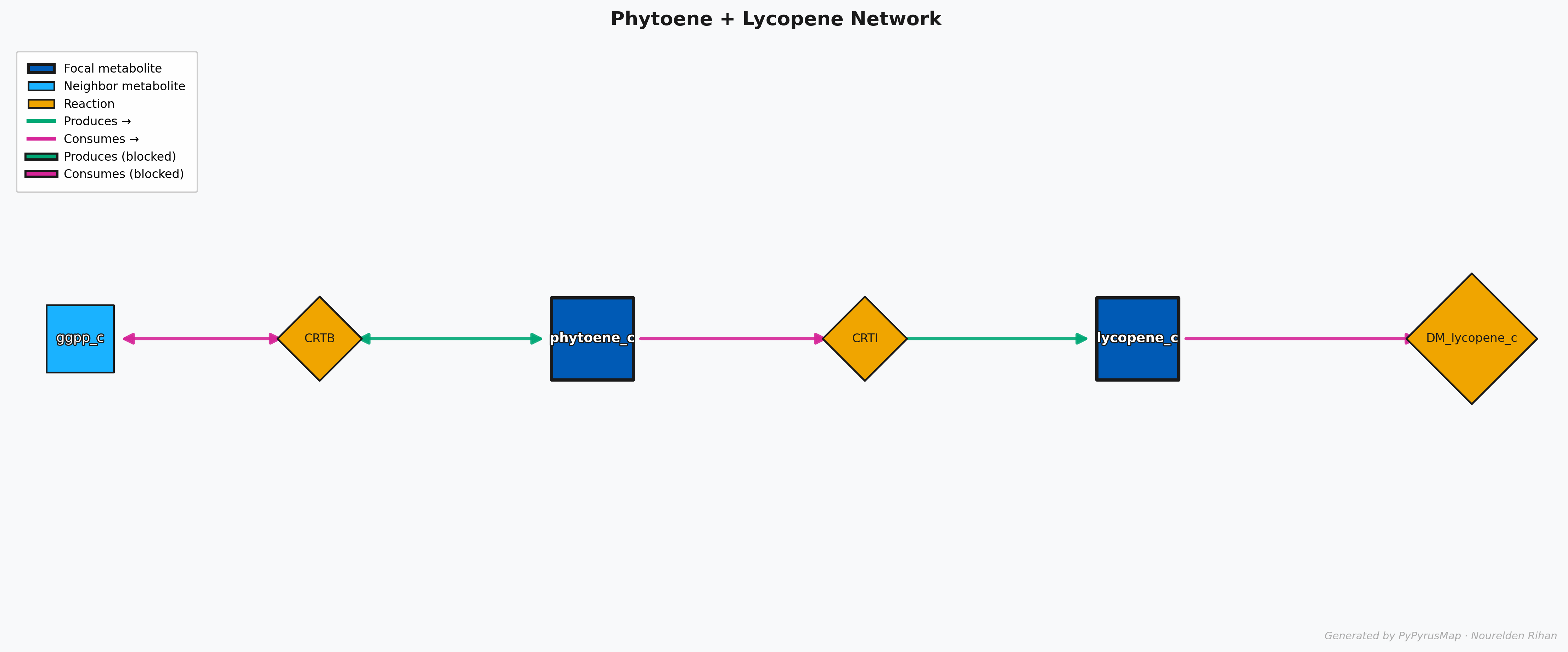
This graph doesn’t only need to be used to visualize the neighborhood of one metabolite of interest, you can add as many metabolites as you want to the graph and it will automatically visualize the neighborhood of all of them together in one graph.
Let’s say you want to visualize the neighborhood of both Phytoene and Lycopene together, you can simply add them Phytoene to the same session before rendering the graph:
1
2
3
4
5
session.add("phytoene_c")

# Render the graph
fig = session.render(title="Phytoene + Lycopene Network", figsize=(15, 6))
fig.show()
PyPyrus Map Phytoene + Lycopene Network Graph
This will give you a graph that shows the neighborhood of both metabolites together, and you can easily see how they are connected through the reactions in the model.
Also Do you want to have fluxes values on the graph? No problem, you can simply run FBA or any other analysis to get the fluxes and then pass it to the session initializtion function and then set displaying it to True on the render() function to have them displayed on the graph:
1
2
3
4
5
6
7
8
9
10
model.objective = lycopene_demand.id # Set Lycopene production as the objective
solution = model.optimize()

# Create a PyPyrus Map session and add the Lycopene metabolite
session = PyPyrusMap(model, solution=solution)
session.add("lycopene_c")

# Render the graph
fig = session.render(title="Lycopene Network", show_flux_labels=True, figsize=(15, 6))
fig.show()

PyPyrus Map Lycopene Network with Flux Values Graph
This will give you a graph that shows the flux values on the edges of the graph, so you can easily see which reactions are carrying more flux and which ones are less active in the current solution.
It can also be used to visualize even bigger and more complex neighborhoods, for example you can visualize the neighborhood of all the metabolites in the Lycopene pathway together in one graph:
1
2
3
4
5
6
7
8
# Create a PyPyrus Map session and add the Lycopene metabolite
session = PyPyrusMap(model)
session.add("ipdp_c")
session.add("frdp_c")

# Render the graph
fig = session.render(title="IPP + FPP Network", figsize=(15, 6))
fig.show()
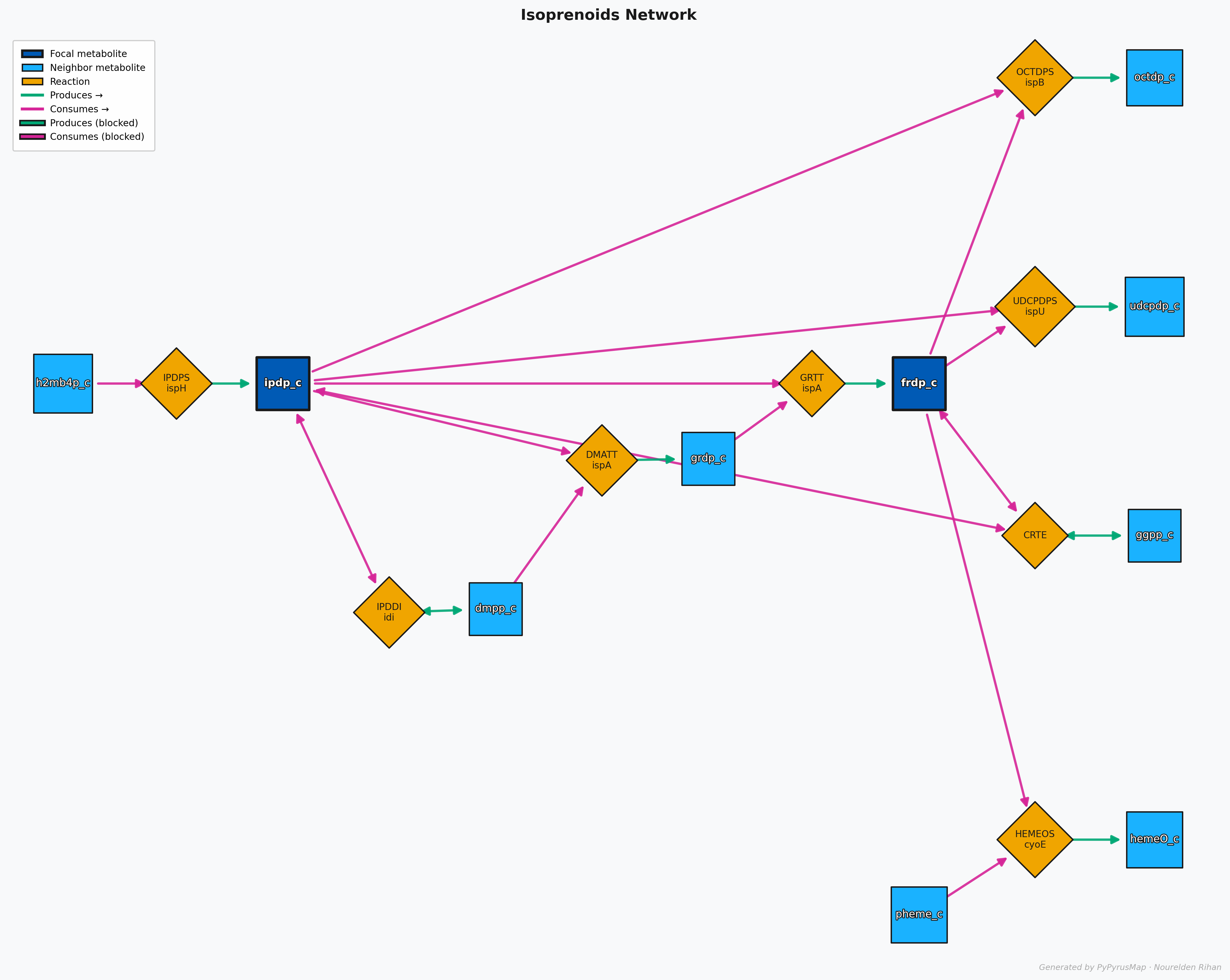
PyPyrus Map Isoprenoids (IPP + FPP) Network with Graph
This Map shows the neighborhood of both IPP and FPP together, and you can see how they are connected to each other and to the rest of the network.
You can checkout this Google Colab Notebook to run this tutorial and produce the graphs yourself
For More Details on Customization Options, Check the PyPyrus Map Documentation on GitHub
Wrap Up
PyPyrus Map is a powerful tool for visualizing the metabolic neighborhood of any metabolite in a COBRApy model, it is especially useful when working with models that have heterologous and non-native pathways introduced to them, as it allows you to easily visualize the connections between the new pathways and the existing metabolism without the need to redraw pathway maps.
It also provides a variety of customization options and supports exporting the graphs in multiple formats, making it a great tool for both analysis and presentation purposes.
PyPyrus Map is also available on Zenodo and is Open Source on GitHub, so you can check it out, contribute to it, or use it in your own projects.
If PyPyrus Map is used in any research work, please consider citing it:
Rihan, N. PyPyrus Map: Metabolic neighborhood visualization for COBRApy genome-scale models. (2026). DOI: 10.5281/zenodo.18870982
PyPyrus Map was developed with the assistance of Claude (Anthropic), a large language model used for code generation and implementation. All research direction, architectural decisions, feature design, and validation were conceived and directed by the author.